
A first-time rider approaches public transit with a private uncertainty: whether they bought the right ticket, chose the right route, understood the time correctly, and will know what to do when the train arrives. The interface should reduce that uncertainty. Too often, it performs it. Metrolink's ticketing experience felt closer to paperwork than movement. This redesign treated the app as part of the ride itself, a sequence of decisions that needed to feel already in motion before the train even arrived.

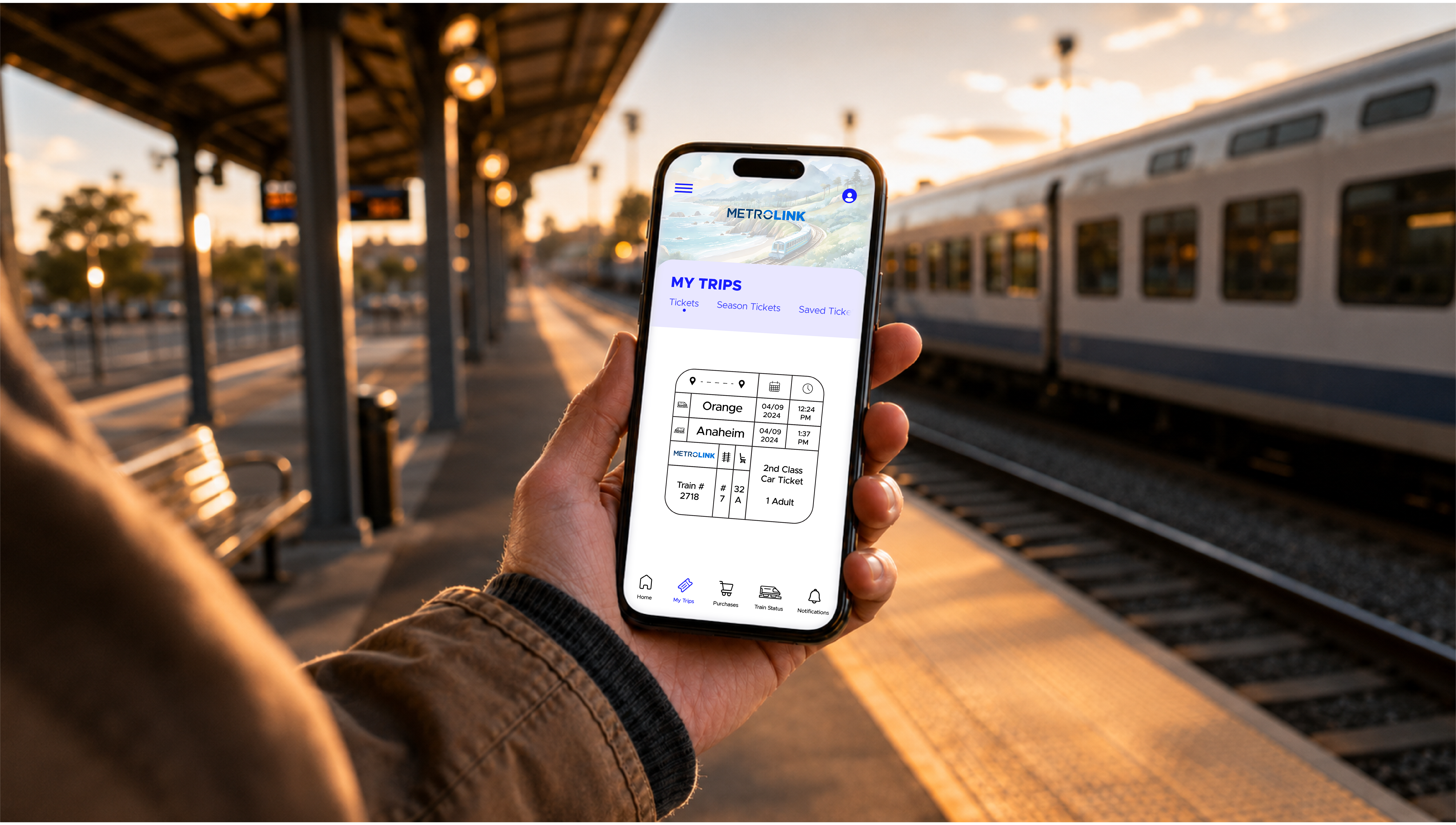
The interface as it's actually used: one-handed, on a platform, checking a ticket before a train.

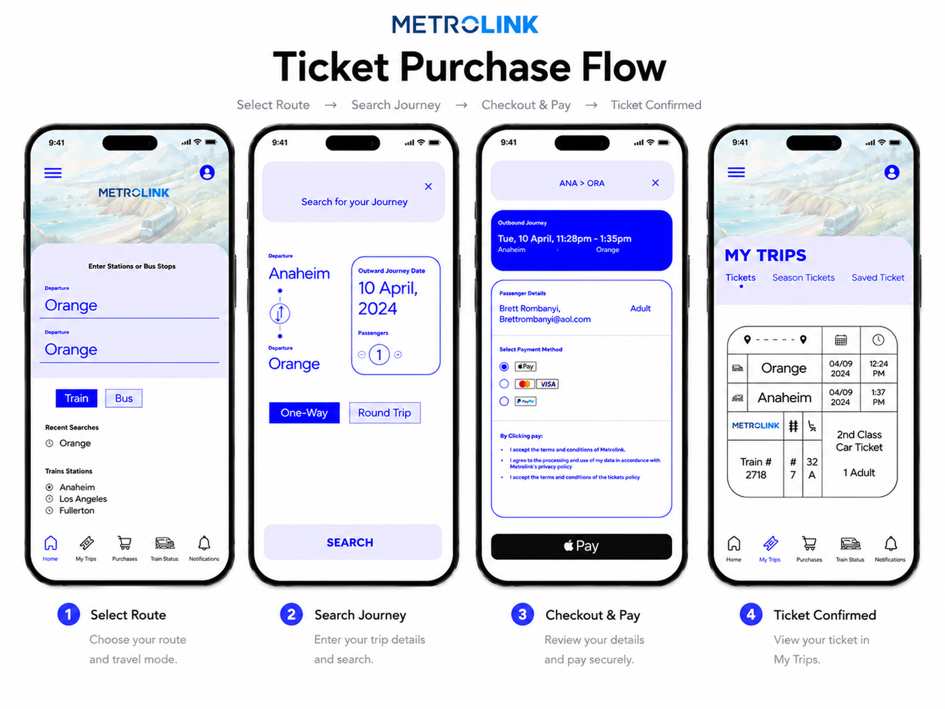
Four screens, one transaction: select a route, search the journey, pay, confirm. The whole task collapsed into steps someone can move through without thinking about it.

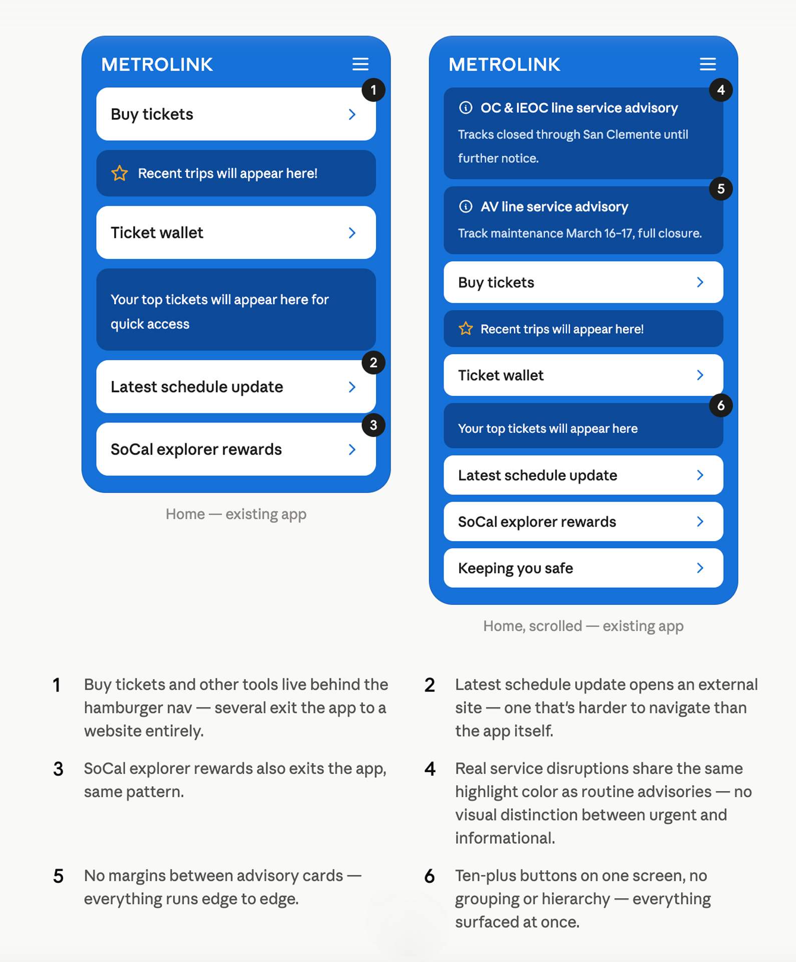
A pass through the live app before designing anything, flagging what wasn't working: tools that exit to a website, no visual distinction between urgent and routine alerts, no hierarchy, no onboarding. Six months of the redesign traces back to problems documented here.
Started from Metrolink's existing brand blue and worked outward from there, testing a range of pairings before narrowing to two: a pale lavender for surfaces, and a saturated #181EFE for anything interactive. Metropolis carried both, holding up on dense schedule screens and simpler confirmation moments alike.
The visual system was built around a single conviction: that buying a ticket should feel like the beginning of something, not a form to get through. High-contrast blue, a softer pastel accent, and watercolor illustration brought warmth to a category that usually settles for utility.
The audit surfaced five distinct failure modes in the existing app: broken user flows, buried navigation, a home screen that violated Hick's Law, and alert content that looked identical to routine information. Each had a fix, but the fixes shared a common logic.


The interface as it's actually used: one-handed, on a platform, checking a ticket before a train.
Four screens, one transaction: select a route, search the journey, pay, confirm. The whole task collapsed into steps someone can move through without thinking about it.
A pass through the live app before designing anything, flagging what wasn't working: tools that exit to a website, no visual distinction between urgent and routine alerts, no hierarchy, no onboarding. Six months of the redesign traces back to problems documented here.
Started from Metrolink's existing brand blue and worked outward from there, testing a range of pairings before narrowing to two: a pale lavender for surfaces, and a saturated #181EFE for anything interactive. Metropolis carried both, holding up on dense schedule screens and simpler confirmation moments alike.
A first-time rider approaches public transit with a private uncertainty: whether they bought the right ticket, chose the right route, understood the time correctly, and will know what to do when the train arrives. The interface should reduce that uncertainty. Too often, it performs it. Metrolink's ticketing experience felt closer to paperwork than movement. This redesign treated the app as part of the ride itself, a sequence of decisions that needed to feel already in motion before the train even arrived.
The visual system was built around a single conviction: that buying a ticket should feel like the beginning of something, not a form to get through. High-contrast blue, a softer pastel accent, and watercolor illustration brought warmth to a category that usually settles for utility.
The audit surfaced five distinct failure modes in the existing app: broken user flows, buried navigation, a home screen that violated Hick's Law, and alert content that looked identical to routine information. Each had a fix, but the fixes shared a common logic.